What are we trying to learn from the test?
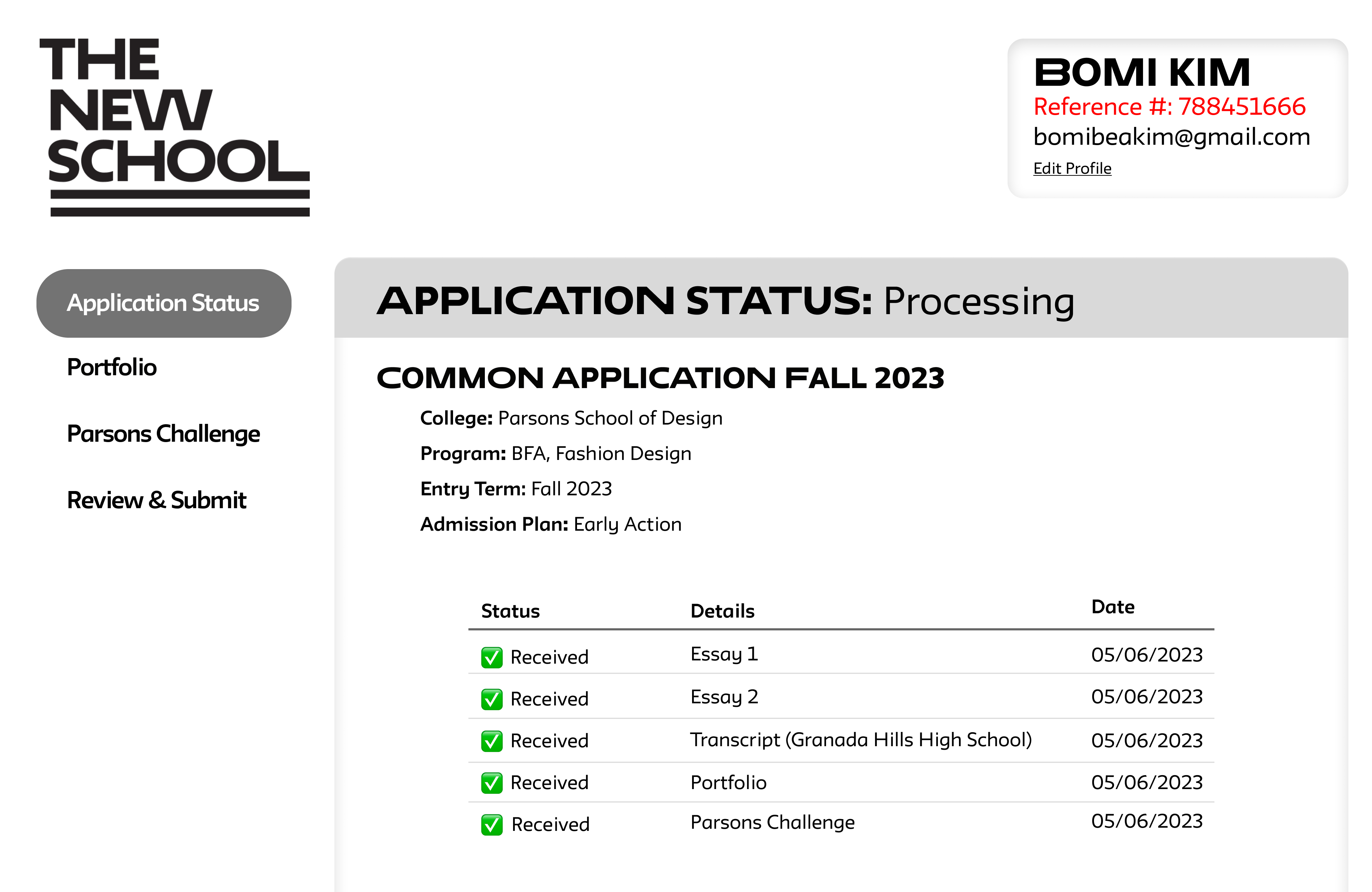
I am an admission counselor for Parsons School of Design at The New School. Once the application deadline rolled around we started receiving 40-50 emails from confused applicants. Some of the emails were asking how to access specific pages to finish the task at hand and other emails were saying that applicants accidentally submitted their applications without finishing all the necessary tasks.
Through this usability test I was hoping to find out:
- Why are so many applicants making mistakes? What about the wording, layout, etc causes confusion for the user?
- What we can do to improve the interface to make it a more intuitive process?
Background
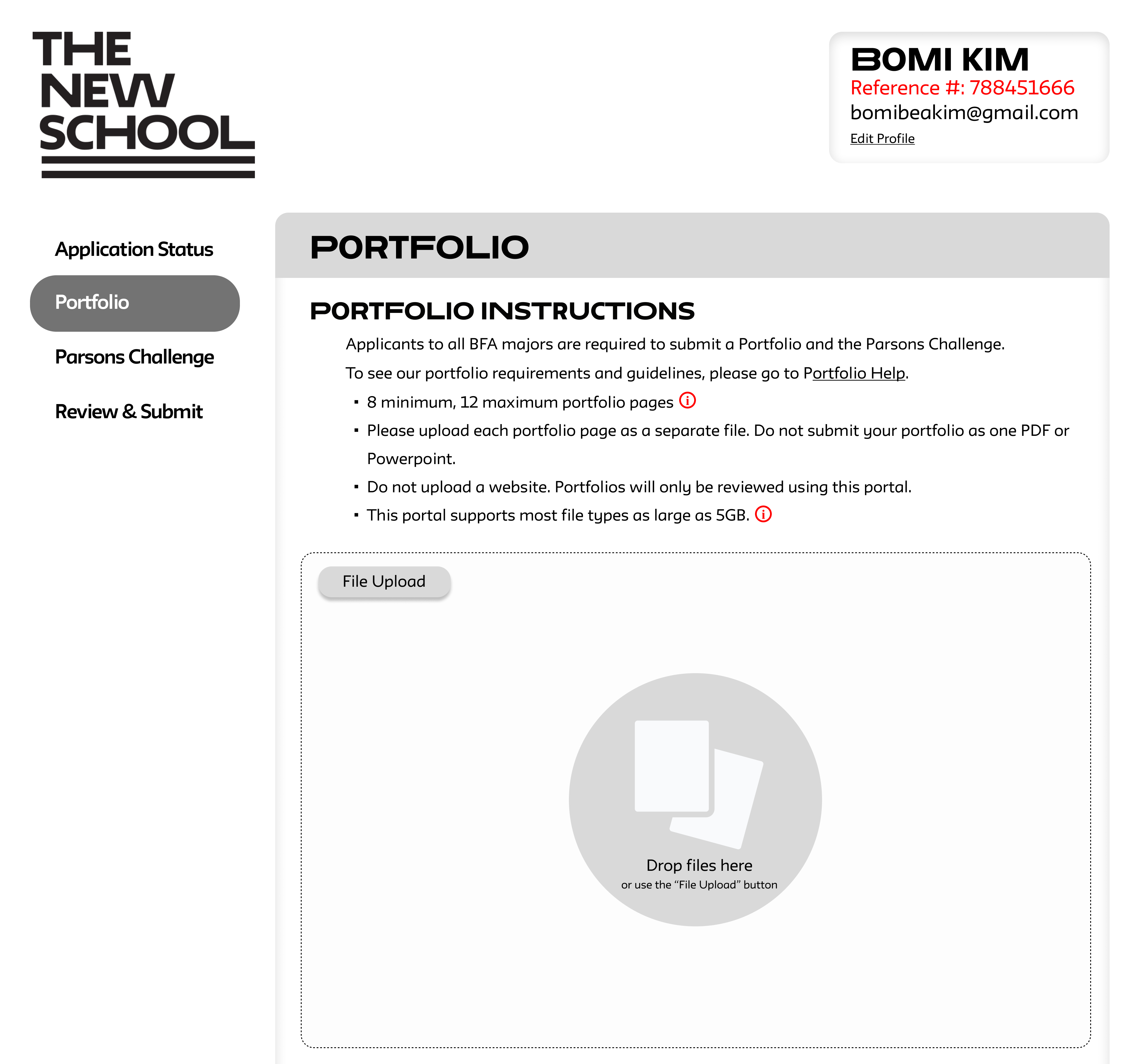
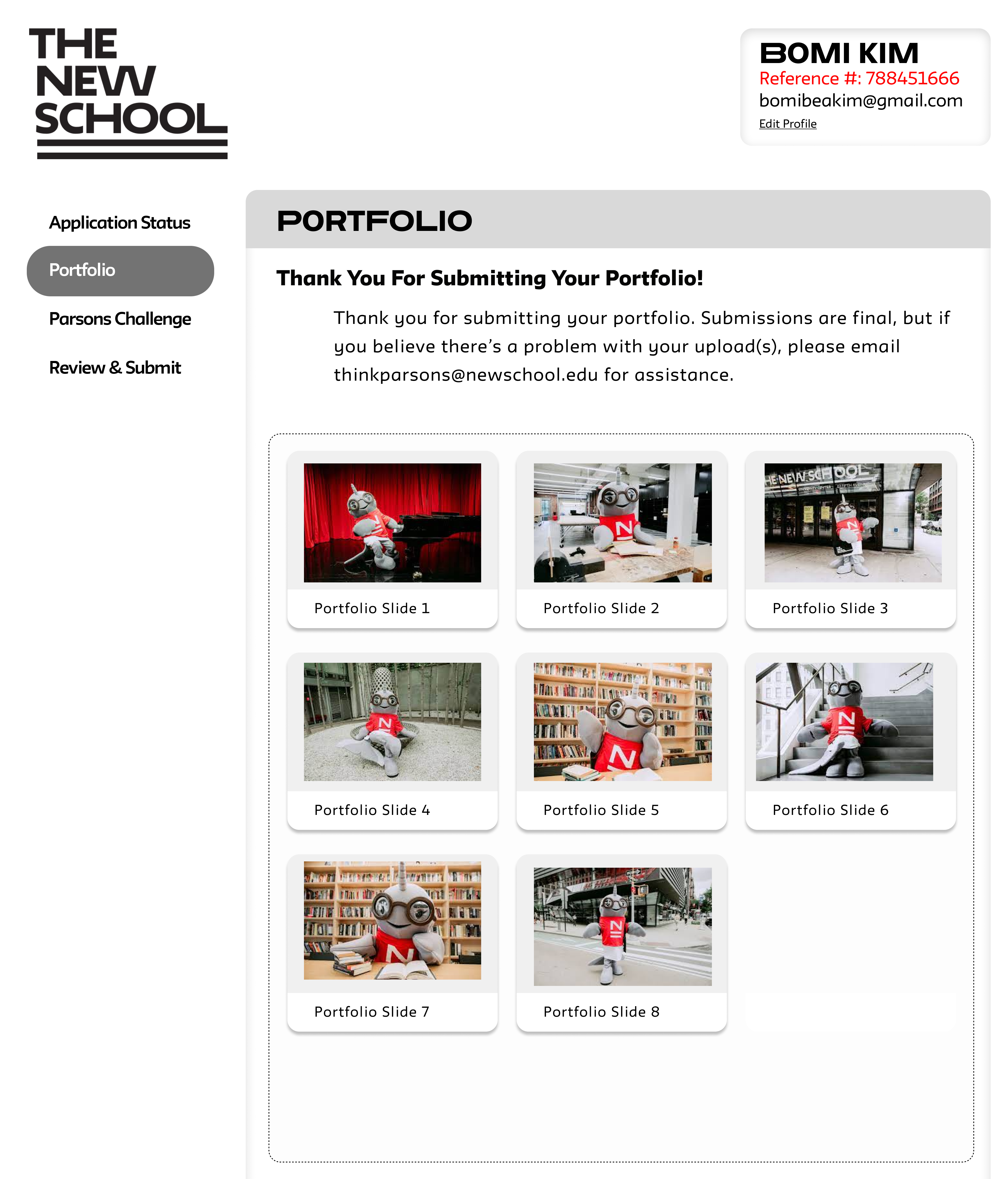
At Parsons, we ask our applicants to use The New School Application Center to upload their required application materials. There are 3 required materials students must submit using this page.
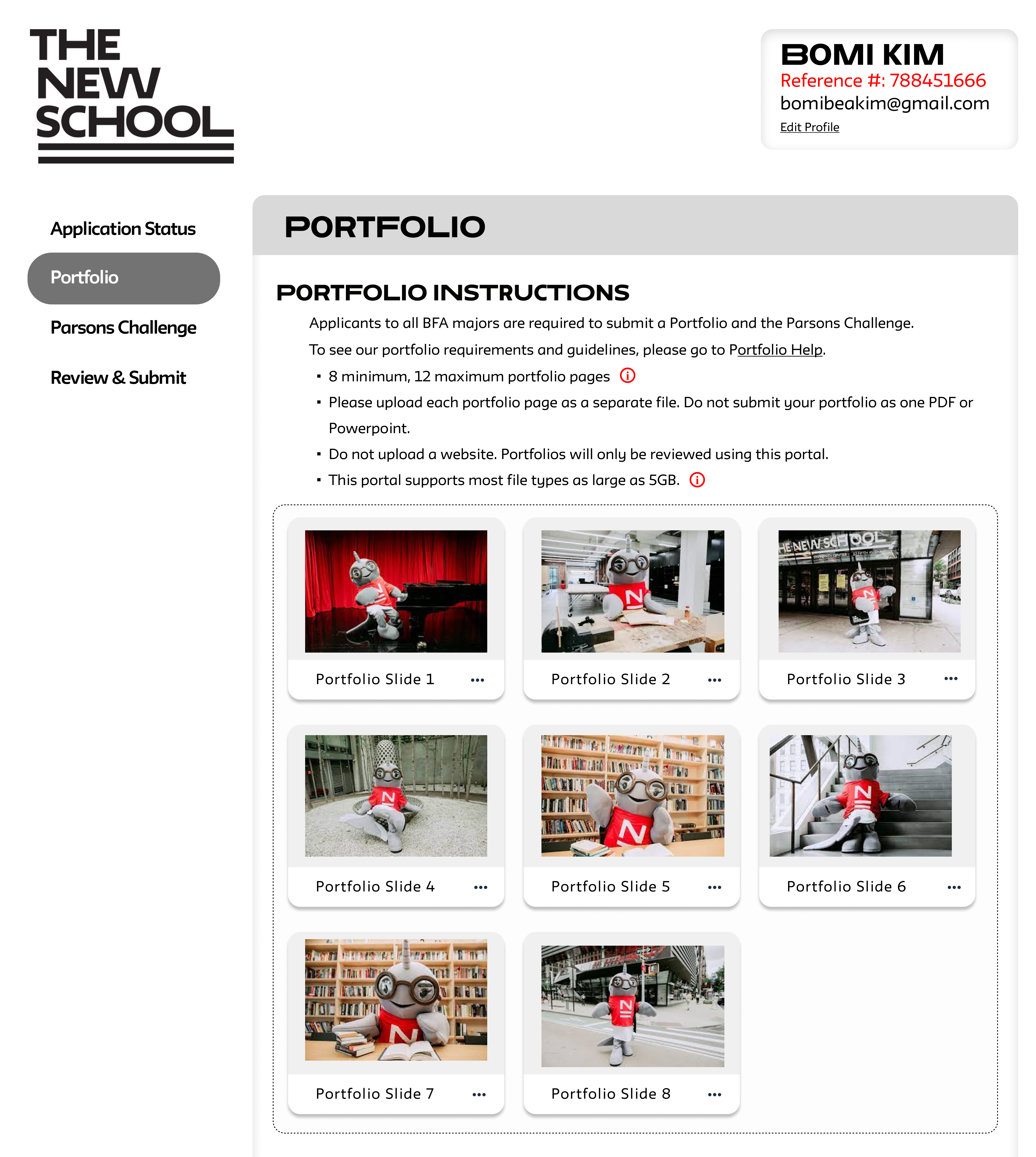
- Portfolio with 8 slides minimum
- One Parsons challenge essay
- Parsons Challenge Artwork
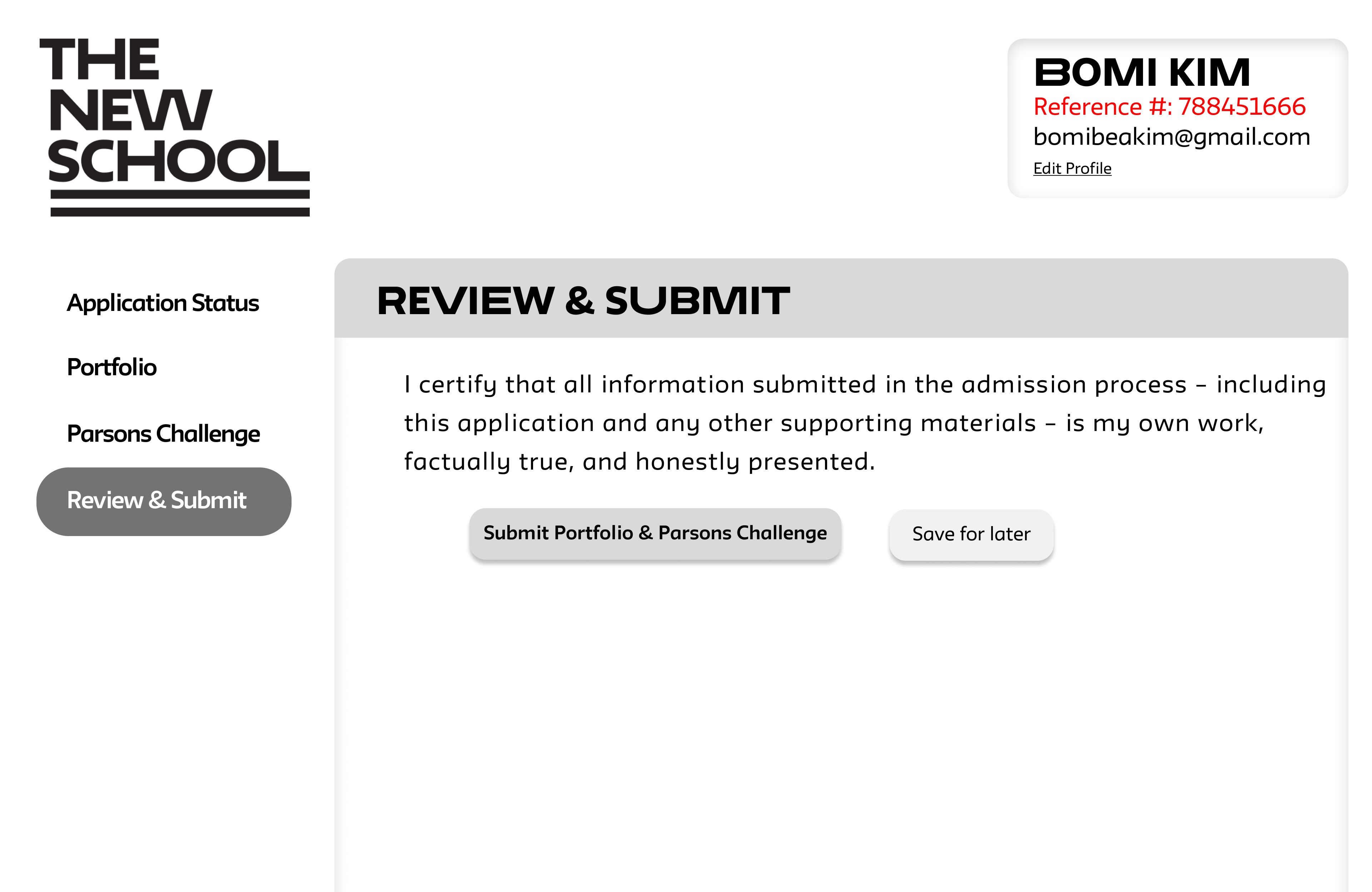
Applicants must indicate that they have completed the submission after they have uploaded these required documents. They are asked to do twice, first after submitting the Parsons Challenge materials and then another time after submitting their Portfolio. Once the submission has been completed they are not able to change and edit the submission.

Applicant selecting to show they have completed their submission.
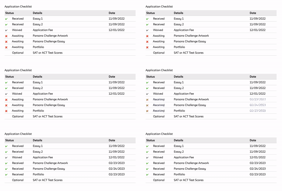
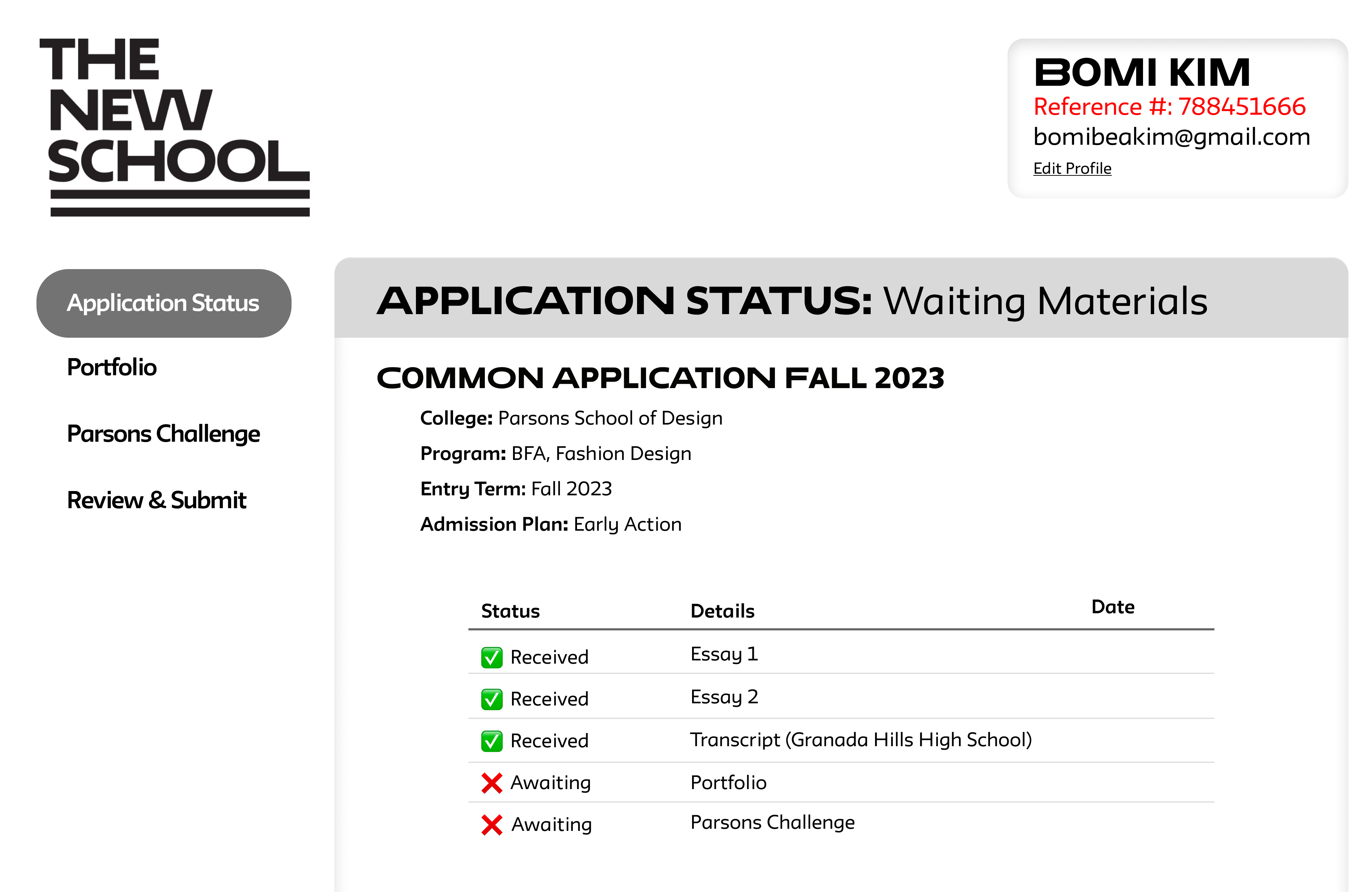
Applicants can also use TNS Admission Hub to check the status of their required application materials.
Users
With this specific application, we are looking at users who are:
- between 17-30 years of age
- with a high school degree or some college background
- pursuing higher education in Art and Design.
We were able to test 3 users


Gnarls Narwhal(The New School Mascot)
Tests were conducted remotely to best mimic an applicant’s environment since applications are done on users’ own computers at home.
We asked Users to fulfill 5 Tasks:
- Find the portfolio submission page
- Upload portfolio
- Go back to the admission hub from portfolio submission page
- Upload Parsons Challenge Essay and Parsons Challenge artwork
- Complete submission
Results
| Tasks | User 1 | User 2 | User 3 |
|---|---|---|---|
| 1. Find the portfolio submission page | 🐢 | 🐢 | ✅ |
| 2. Upload your portfolio | 🐢 | 🐢 | ✅ |
| 3. Go back to the Admission Hub from the portfolio submission page | ✅ | 🐢 | 🐢 |
| 4. Upload Parsons Challenge Essay and Parson Challenge artwork | 🐢 | ❌ | 🐢 |
| 5. complete submission | 🐢 | ✅ | 🐢 |
✅ Success with no issues
❌ Task not complete
The good news is only one user wasn’t able to complete one of the tasks and everyone was ultimately able to succeed in finishing the rest of the tasks. Out of all the task successes, there were 4 successes with no issues. The rest were all successes in a round-about way.
System Usability Scale (SUS) Scores
| User 1 | User 2 | User 3 |
|---|---|---|
SUS Score: 5 This score may be described as worst imaginable. | SUS Score: 50 This score may be described as poor. | SUS Score: 60 This score may be described as ok. |
After the tests, the users felt frustrated and ultimately wanted to email us to confirm the status of the application materials.
“I’m feeling incredibly frustrated. The admission hub feels broken. If the application process is this challenging, I can’t help but question whether the rest of my educational experience will be similarly arduous. Will we have to use the same program to register for classes? These issues are starting to raise concerns for me. This feels like a red flag.”
-User 1
High Severity Issues
I found that these were the issues we needed to address for a better user experience.
- Parsons Challenge artwork submission
- Checklist
- User Flow
Parsons Challenge Artwork Submission
If we go back to the test analysis chart, all 3 users had some issues with the Parsons Challenge submission.
| 4. Upload Parsons Challenge Essay and Parsons Challenge artwork | 🐢 | ❌ | 🐢 |
❌ Not complete the task
This was the most frustrating task for all 3 users and they spent the most time. The users felt that our application was broken because when they click on the Parsons Challenge artwork submission link, it led them back to the portfolio submission page. This was because it wasn’t clear to the users that their Parsons Challenge Artwork needed to be submitted using the Portfolio Submission Page
Suggestion:
- Make it clear that all artworks (Portfolio and Parsons Challenge Artwork) need to be submitted using the same page
- Allow users to upload their parsons challenge artwork with their essays
Checklist
The checklist too too long to update.
All users were attracted to the checklist because it was clear, and had colors. However, they were frustrated when the checklist did not show any change once they submitted their application materials. They wanted to email us to confirm that their materials were uploaded properly.
Suggestion:
- Show a pending sign once applicants have submitted their materials
- Have a more responsive checklist so it says that we have received their materials once the user was done with the task
User Flow
Another High severity problem was the user flow
I was surprised that during the usability test, only one user submitted their application without uploading all of their required materials. Since the biggest issue stated in the emails from actual applicants was that they submitted their applications before uploading all their materials.
Then I realized that for the usability test, I had to give one task at a time; users were asked to finish one task before going to the next. This is not available for the actual applicants
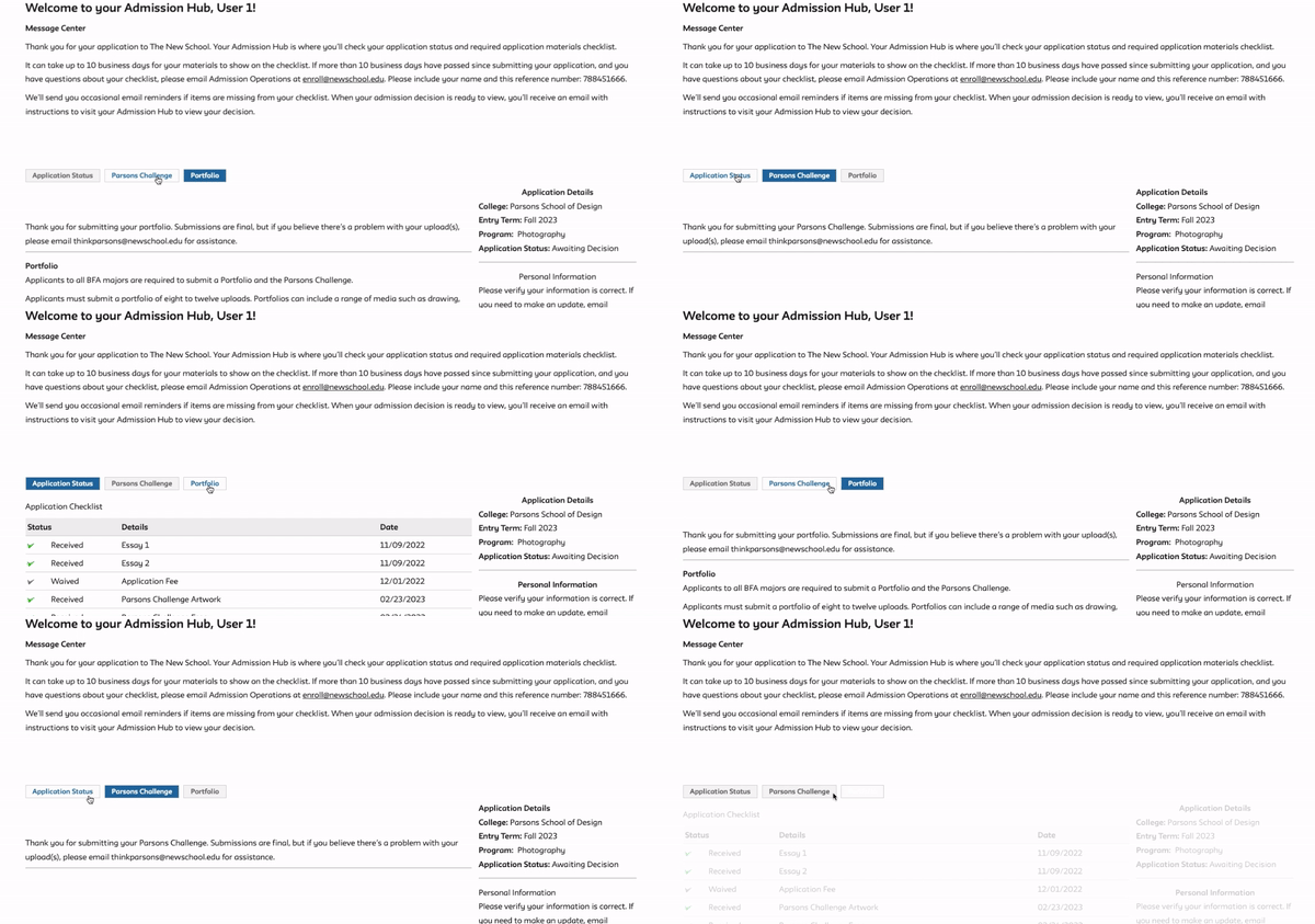
Current Layout
The current layout of the admission hub with the 3 tabs/ buttons, do not indicate any order or hierarchy to the applicant. Plus, having to confirm submission twice confuses the users
Suggestion:
I recommend changing this application format so that user can clearly understand in what order we would like them to fill out the information. Having a review page with a checklist clearly shows the user what has and has not been successfully uploaded
Having one final submit button clearly tells the user that they have successfully finished their application.
